Park Signage System
Park Signage
System
Client: Humber Arboretum
Focus: Signage Design · Wayfinding
Role: Graphic Designer · Signage Designer
Client: Humber Arboretum
Focus: Signage Design · Wayfinding
Role: Graphic Designer · Signage Designer
Client: Humber Arboretum
Focus: Signage Design · Wayfinding
Role: Graphic Designer · Signage Designer
The challenge: Create a cohesive, highly visible wayfinding signage system for the Humber Arboretum that doesn't disrupt the natural landscape.
My solution: After a visit to the site and environmental research, I designed a system that bridges the gap between the organic and the built environment. I paired natural materials like stone and wood with durable plastics to withstand seasonal changes. The system utilizes a modern, minimalist layout to ensure maximum legibility across all touchpoints, including informational kiosks, trail maps, and educational displays.
Results: The result is an integrated, visually harmonious signage system that seamlessly guides visitors. It successfully provides essential directions and ecological information while letting the natural beauty of the park take the central stage.
Development
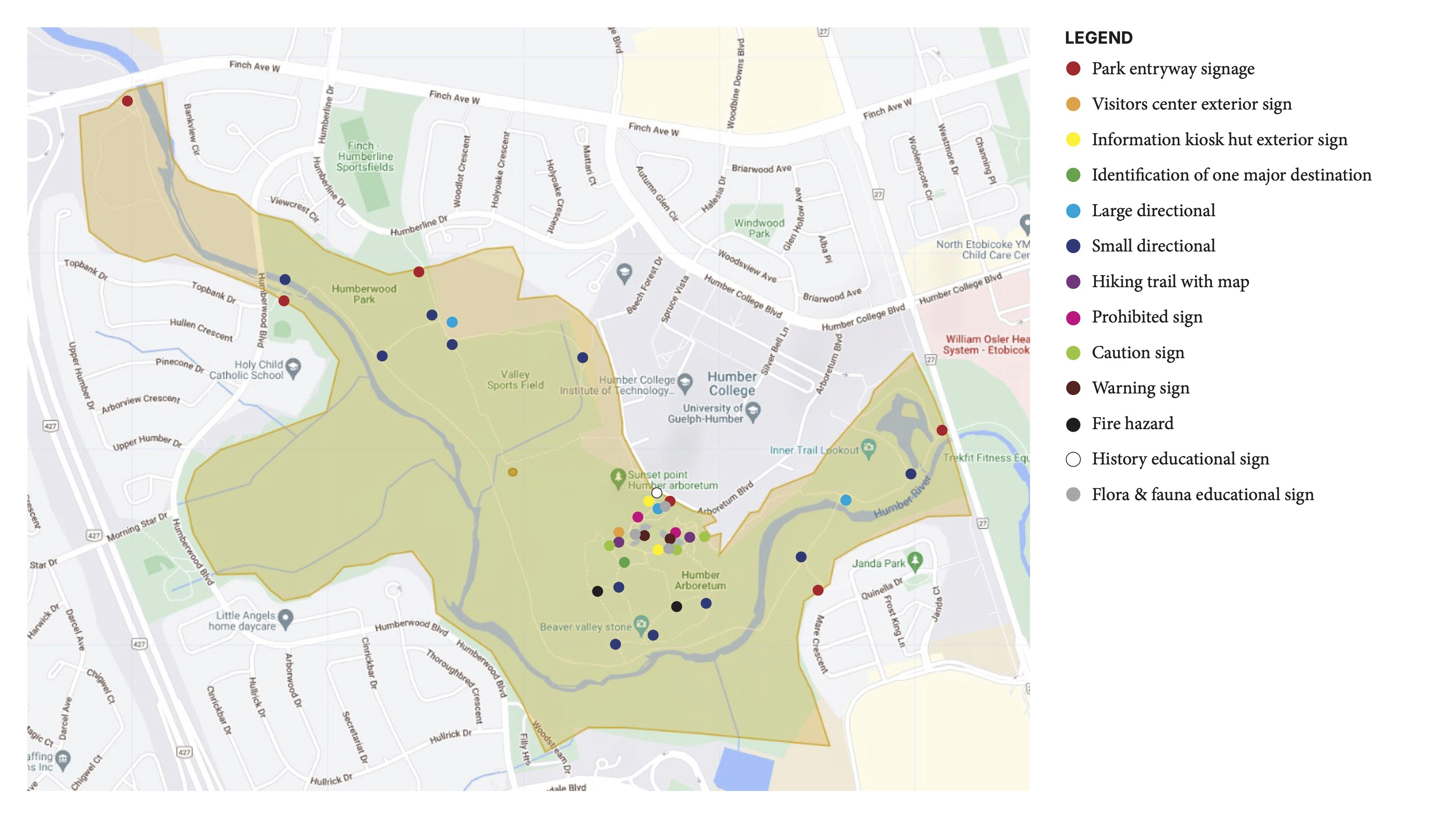
To design an effective wayfinding system for the Humber Arboretum, my first step was understanding the balance between the living ecosystem and user needs. The objective was to provide intuitive navigation for students and wellness seekers without interrupting the natural beauty of the space. I tackled this by establishing a strict, minimalist design language focused on ecological integration. This early commitment to sustainable, natural materials and non-intrusive layouts drove every design decision that followed.
To design an effective wayfinding system for the Humber Arboretum, my first step was understanding the balance between the living ecosystem and user needs. The objective was to provide intuitive navigation for students and wellness seekers without interrupting the natural beauty of the space. I tackled this by establishing a strict, minimalist design language focused on ecological integration. This early commitment to sustainable, natural materials and non-intrusive layouts drove every design decision that followed.
To design an effective wayfinding system for the Humber Arboretum, my first step was understanding the balance between the living ecosystem and user needs. The objective was to provide intuitive navigation for students and wellness seekers without interrupting the natural beauty of the space. I tackled this by establishing a strict, minimalist design language focused on ecological integration. This early commitment to sustainable, natural materials and non-intrusive layouts drove every design decision that followed.

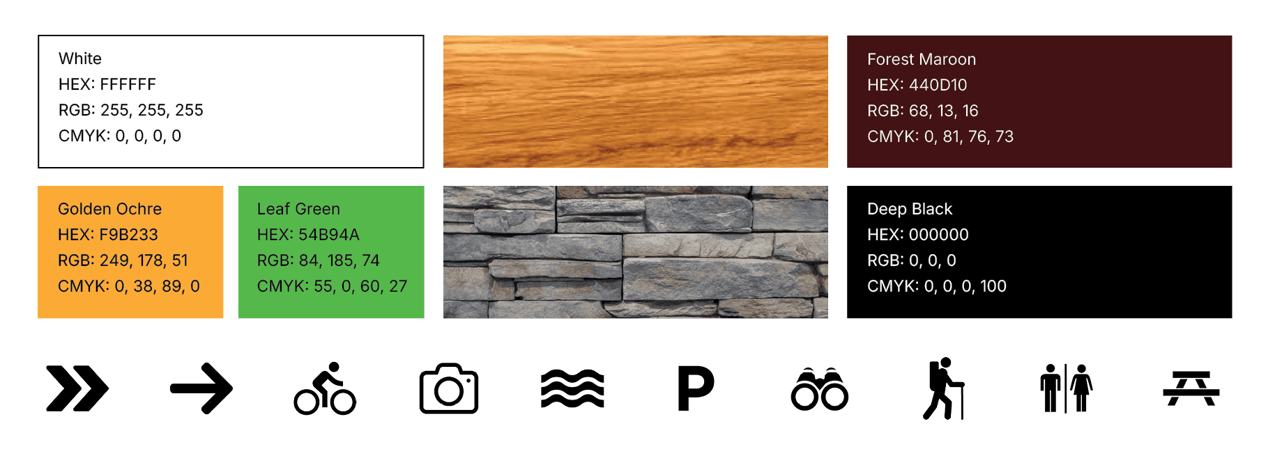
Colour Palette and Iconography
I developed the colour system to balance functional legibility with seamless environmental integration. Natural wood and stone textures will help the system blend into the landscape, while deep brown tones provide visual structure and contrast. I used white primarily text and icons to ensure clarity and accessibility. The golden ochre and leaf green will serve as accents to establish visual identity and wayfinding recognition. Together, the palette creates a signage system that is readable, intuitive, and emotionally aligned with the Humber Arboretum’s natural and community-focused identity.
For the iconography I used icons with rounded corners to create a friendlier aesthetic.
Typography
For the typography, I chose Frutiger LT Std because it is a classic wayfinding typeface that offers excellent legibility from medium to long distances while remaining clean, modern, and neutral.
For the typography, I chose Frutiger LT Std because it is a classic wayfinding typeface that offers excellent legibility from medium to long distances while remaining clean, modern, and neutral.
For the typography, I chose Frutiger LT Std because it is a classic wayfinding typeface that offers excellent legibility from medium to long distances while remaining clean, modern, and neutral.

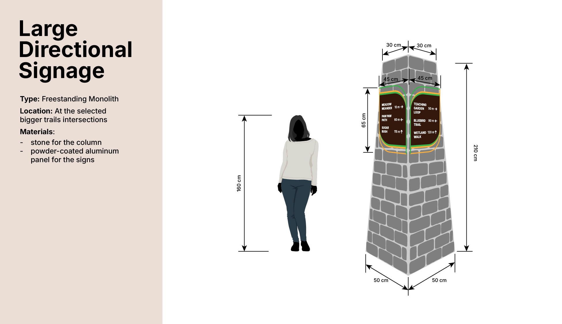
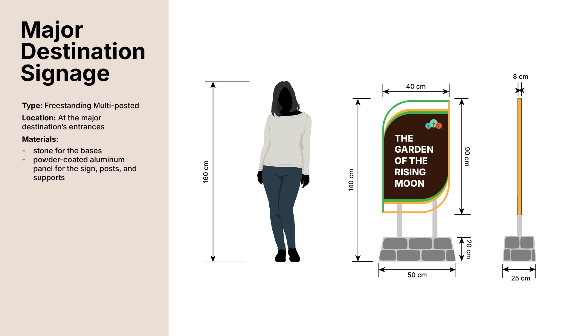
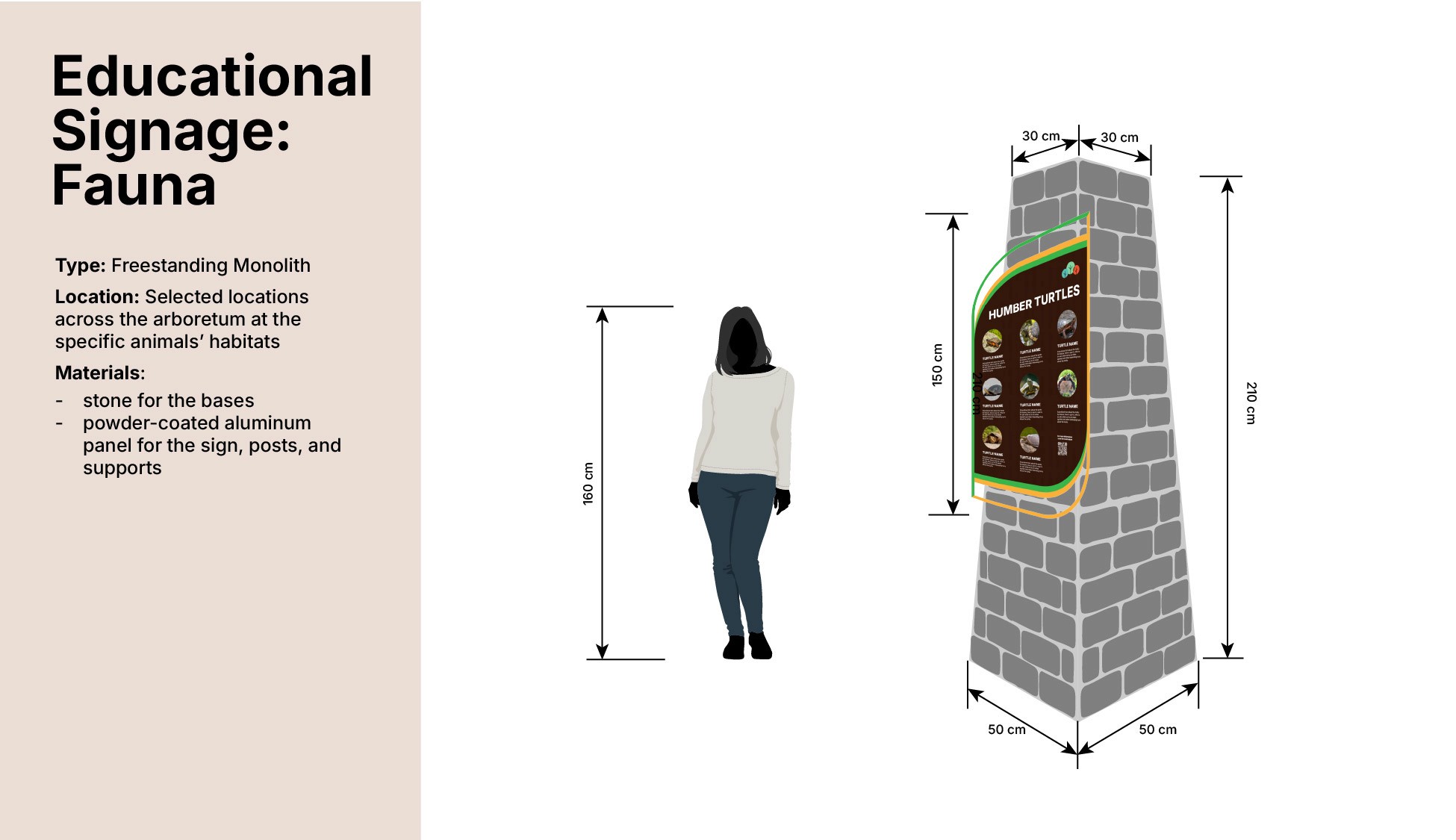
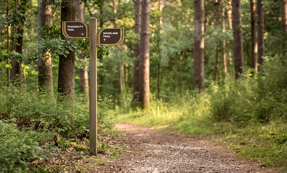
Final Designs
The final result is an integrated, visually harmonious signage system that seamlessly guides visitors. It successfully provides essential directions and ecological information while letting the natural beauty of the park take the central stage.
The final result is an integrated, visually harmonious signage system that seamlessly guides visitors. It successfully provides essential directions and ecological information while letting the natural beauty of the park take the central stage.
The final result is an integrated, visually harmonious signage system that seamlessly guides visitors. It successfully provides essential directions and ecological information while letting the natural beauty of the park take the central stage.

Explore the Whole Project