
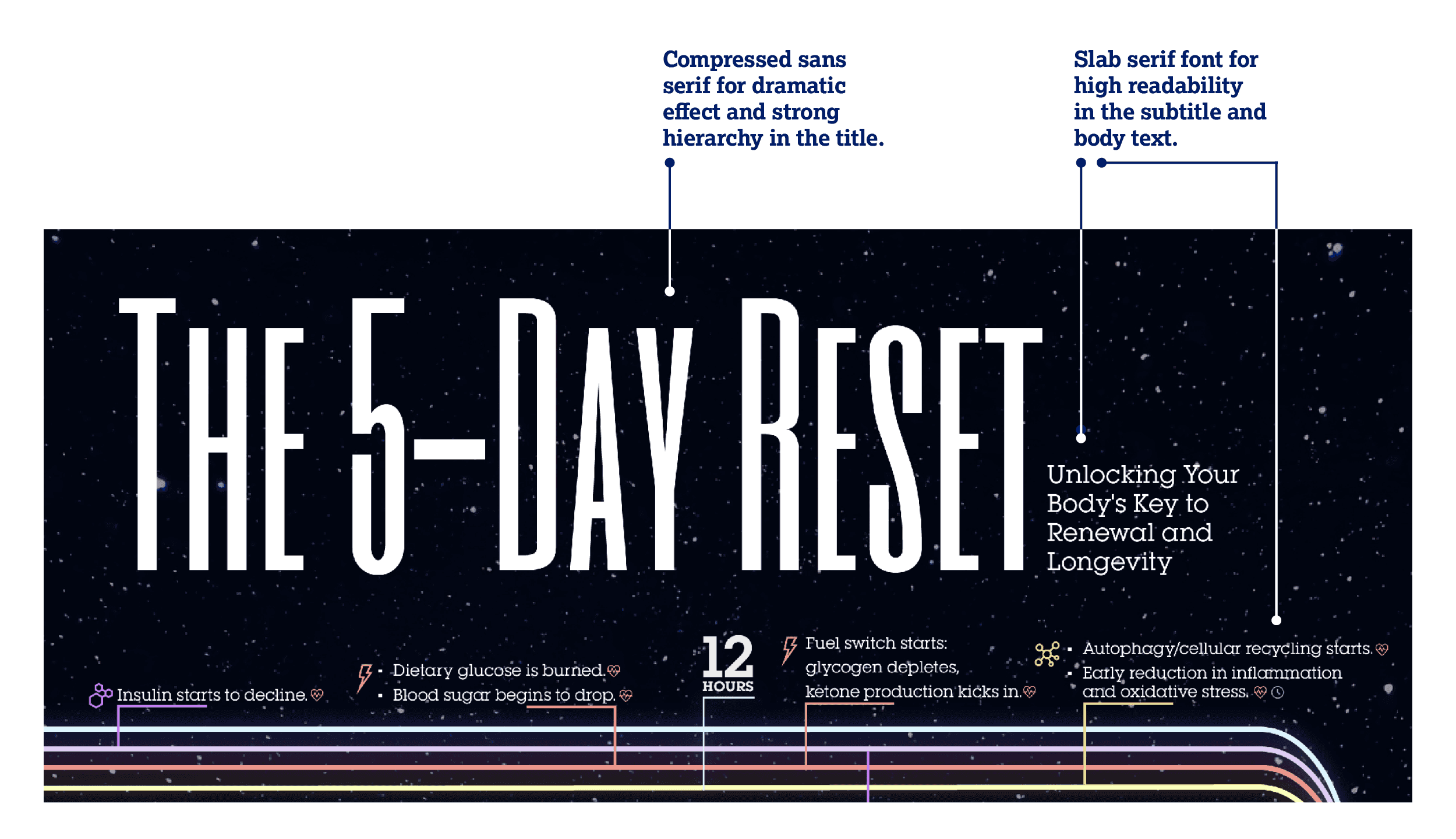
The 5-Day Reset
Prolonged Water Fast Effects on a Human Body
Client: Research-Based Project
Focus: Layout Design · Information Design · Research
Role: Graphic Designer · Researcher
Client: Research-Based Project
Focus: Layout Design · Information Design · Research
Role: Graphic Designer · Researcher
Client: Research-Based Project
Focus: Layout Design · Information Design · Research
Role: Graphic Designer · Researcher
The problem: Water fasting triggers a complex series of physiological changes involving multiple systems operating simultaneously over time. For this project, I needed to translate this dense, research-based information into a format that remained medically accurate while allowing viewers to quickly understand the body’s metabolic journey.
Insight: Through reviewing scientific research on fasting, I identified time as the primary organizing principle. Rather than presenting the information as isolated facts, I reframed fasting as a continuous process, allowing viewers to understand how different physiological systems interact and evolve throughout the experience.
Outcome: I designed a visual timeline that maps the body’s metabolic changes over time using colour-coded pathways, custom iconography, and a clear typographic hierarchy. The final infographic transforms complex scientific information into an accessible visual narrative, demonstrating how strategic information design can simplify technical content without sacrificing accuracy.
Data

Layout
I used a vertical timeline layout to clearly map changes over time, allowing viewers to follow processes intuitively from start to finish. Consistent alignment, spacing, and icon placement create visual rhythm and reinforce information hierarchy.
I used a vertical timeline layout to clearly map changes over time, allowing viewers to follow processes intuitively from start to finish. Consistent alignment, spacing, and icon placement create visual rhythm and reinforce information hierarchy.
I used a vertical timeline layout to clearly map changes over time, allowing viewers to follow processes intuitively from start to finish. Consistent alignment, spacing, and icon placement create visual rhythm and reinforce information hierarchy.

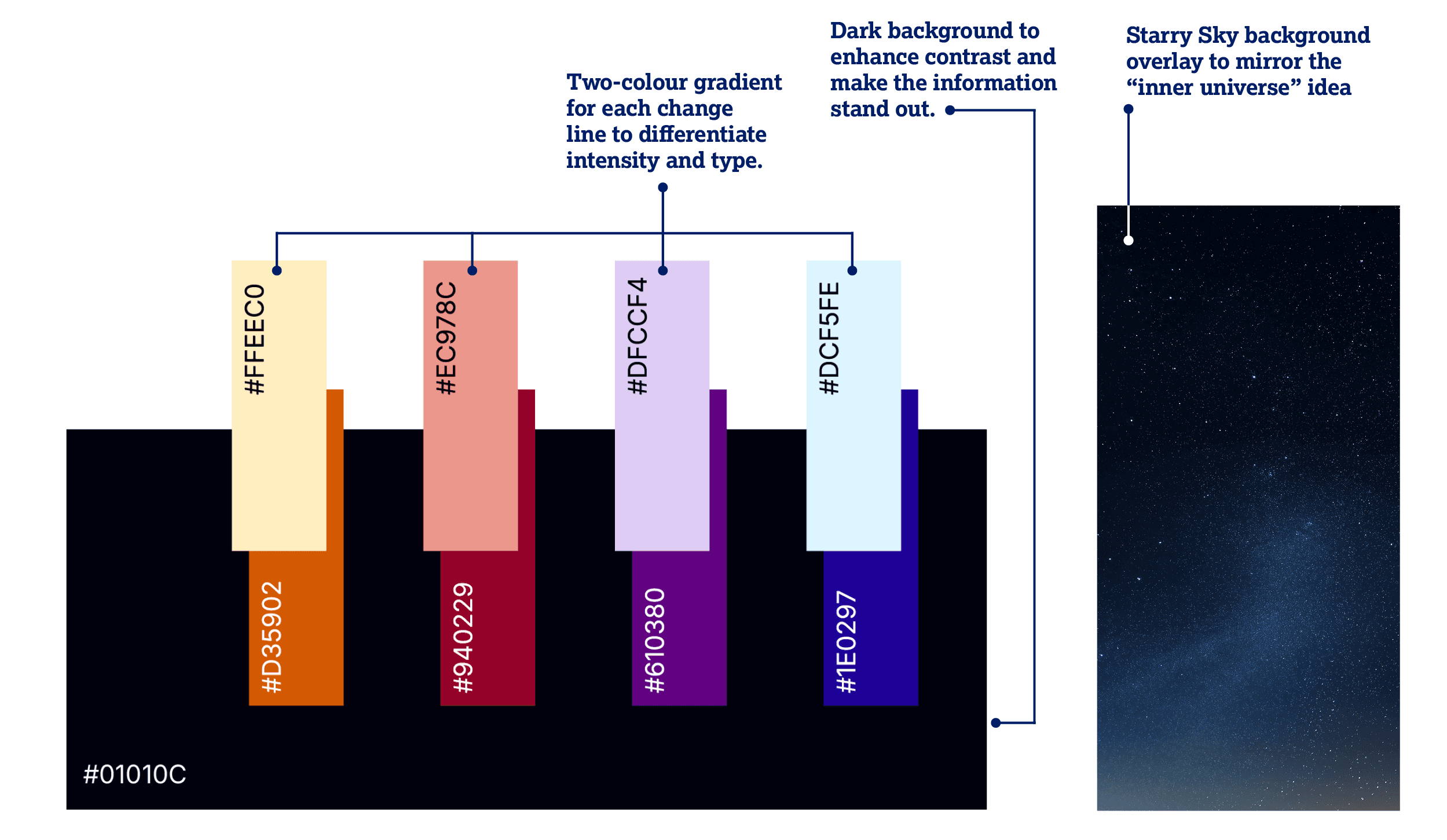
Colour Palette
A dark background paired with soft pastel and saturated accent colours creates strong contrast while maintaining a calm, clinical tone. Gradual colour intensification along the timeline visually reinforces the deepening physiological effects as fasting progresses.
A dark background paired with soft pastel and saturated accent colours creates strong contrast while maintaining a calm, clinical tone. Gradual colour intensification along the timeline visually reinforces the deepening physiological effects as fasting progresses.
A dark background paired with soft pastel and saturated accent colours creates strong contrast while maintaining a calm, clinical tone. Gradual colour intensification along the timeline visually reinforces the deepening physiological effects as fasting progresses.
Typography
A combination of Six Caps and Lubalin Recast Serif Open establishes a strong hierarchy, balancing bold, high-impact headings with highly readable body text. The type system supports clarity and flow, guiding viewers through dense scientific information with ease.
A combination of Six Caps and Lubalin Recast Serif Open establishes a strong hierarchy, balancing bold, high-impact headings with highly readable body text. The type system supports clarity and flow, guiding viewers through dense scientific information with ease.
A combination of Six Caps and Lubalin Recast Serif Open establishes a strong hierarchy, balancing bold, high-impact headings with highly readable body text. The type system supports clarity and flow, guiding viewers through dense scientific information with ease.
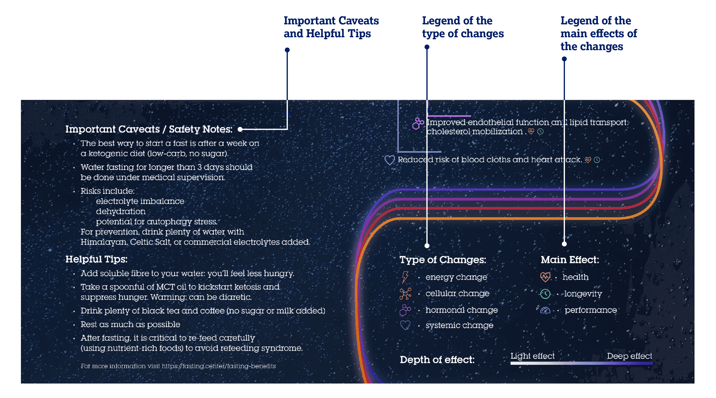
Iconography
A combination of Six Caps and Lubalin Recast Serif Open establishes a strong hierarchy, balancing bold, high-impact headings with highly readable body text. The type system supports clarity and flow, guiding viewers through dense scientific information with ease.
A combination of Six Caps and Lubalin Recast Serif Open establishes a strong hierarchy, balancing bold, high-impact headings with highly readable body text. The type system supports clarity and flow, guiding viewers through dense scientific information with ease.
A combination of Six Caps and Lubalin Recast Serif Open establishes a strong hierarchy, balancing bold, high-impact headings with highly readable body text. The type system supports clarity and flow, guiding viewers through dense scientific information with ease.
Final Design
