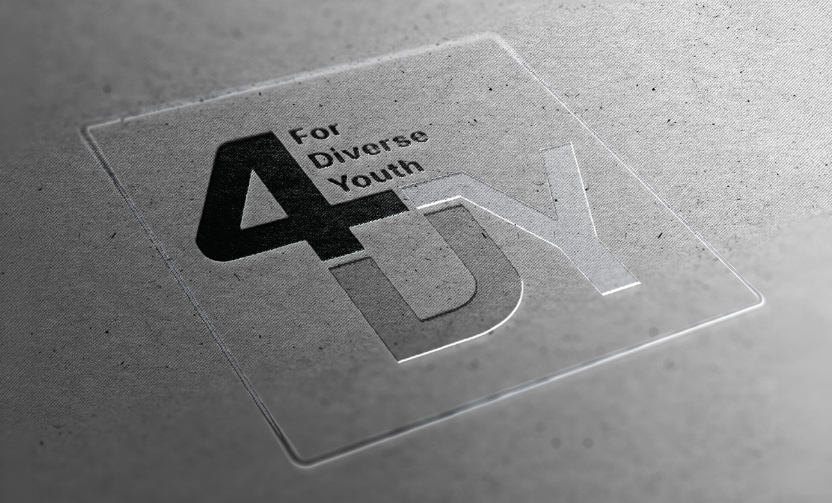
4DY
Client: IDEA initiative at Institute for Work and Health
Focus: Brand Design · Research · Graphic Design
Role: Graphic Designer · Researcher
Focus: Illustration · Graphic Design
Role: Graphic Designer · Illustration
Client: IDEA initiative at Institute for Work and Health
Focus: Brand Design · Research · Graphic Design
Role: Graphic Designer · Researcher
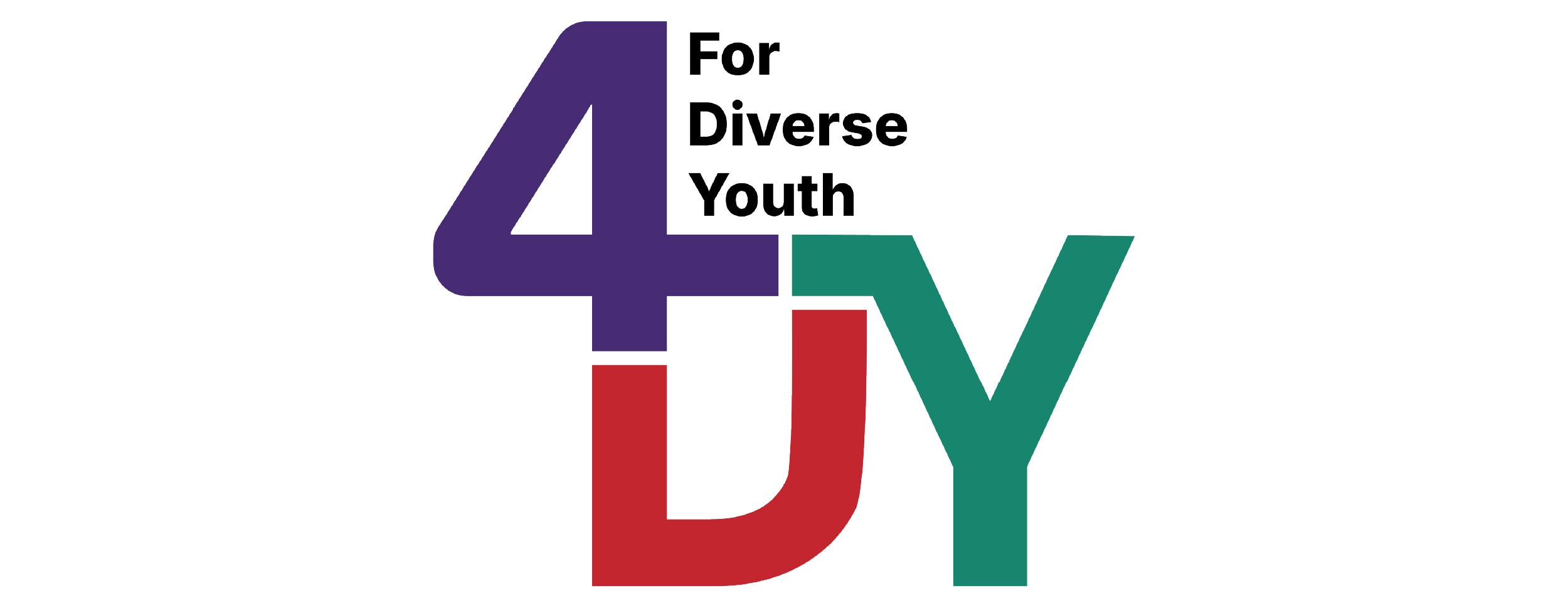
The challenge: The IDEA hub at the Institute for Work and Health needed a visual identity for 4DY (For Diverse Youth), a new initiative focused on supporting neurodivergent youth. The challenge was to create a logo that could establish a distinct identity for the program while remaining visually connected to IDEA’s existing brand system.
Research: Research into the initiative revealed that inclusion, individuality, and neurodiversity needed to be reflected in the identity. At the same time, the logo had to operate within IDEA’s established colour palette and typography guidelines. This shifted the challenge from creating something entirely new to designing within a set of strategic constraints while still achieving differentiation.
Outcome: I developed and tested multiple concepts before refining a final identity that balances recognition and independence. The selected logo maintains visual continuity with the IDEA brand while introducing a subtle infinity symbol referencing neurodiversity, inclusion, and the broad spectrum of human experiences. The result is a distinctive identity that supports the program’s mission while strengthening its connection to the larger IDEA ecosystem.
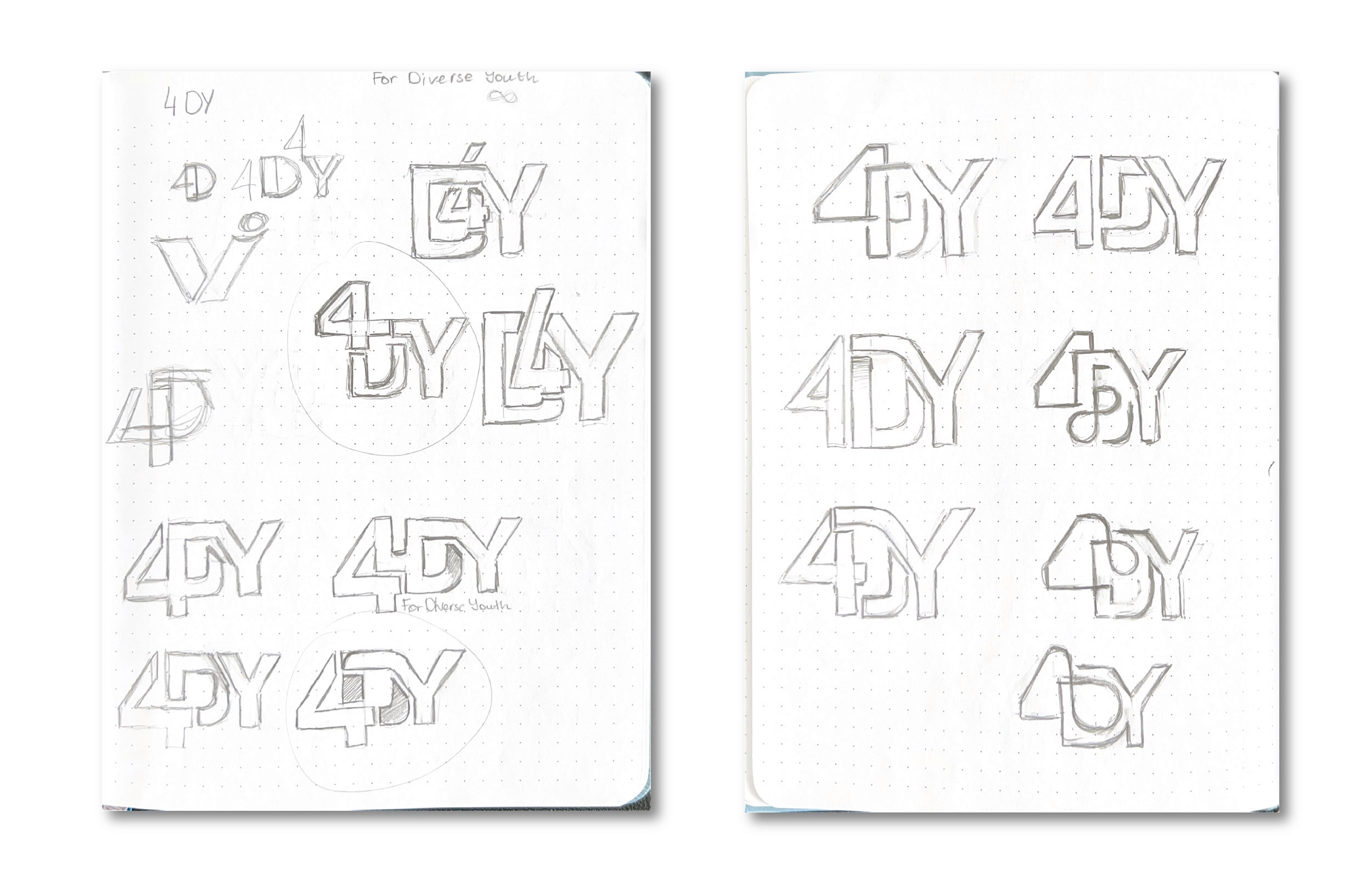
Initial Sketches
After completing my research, I began by sketching multiple concepts and experimenting with the forms and relationships of the logo’s three main elements: the “4,” “D,” and “Y.”
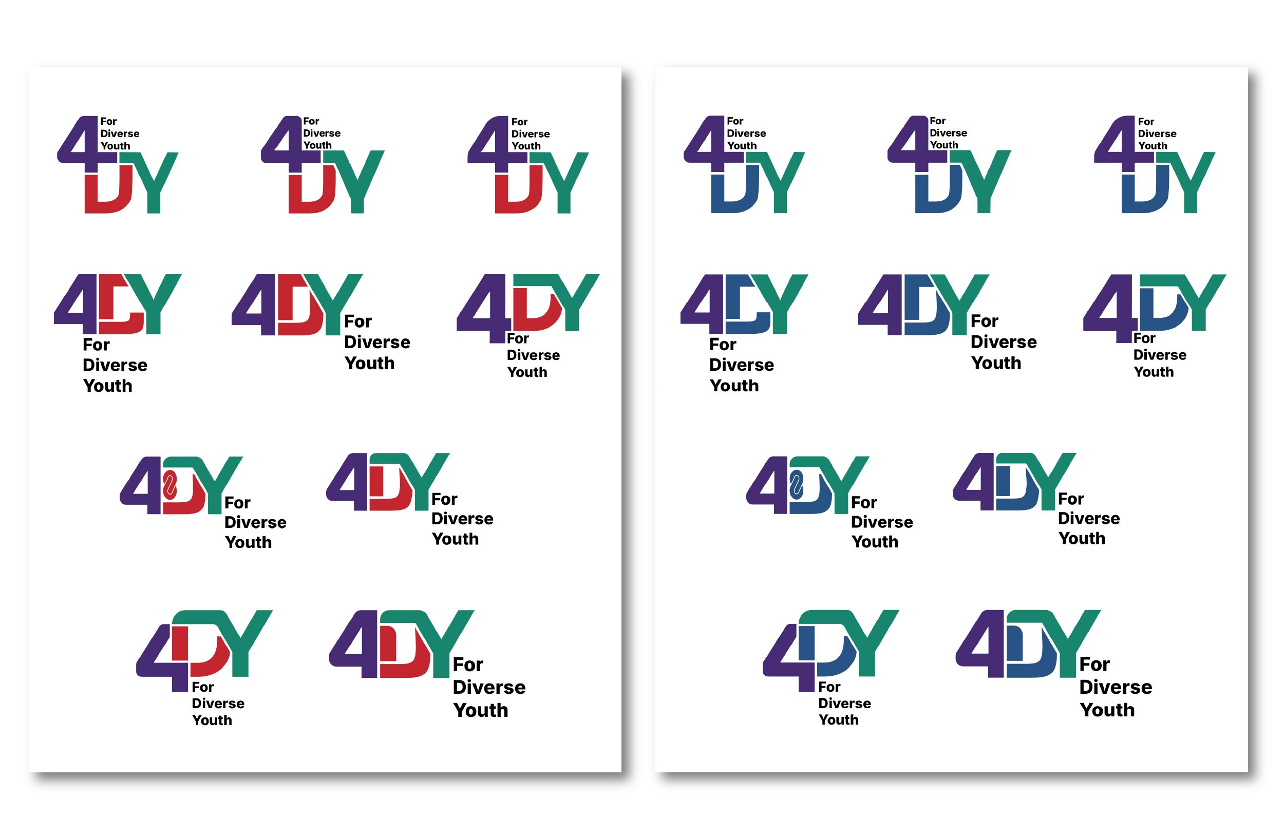
Digital Sketches
I then developed digital versions of the concepts I felt were the most successful and explored several variations of each. While I was required to use IDEA’s established purple and green colour palette, I had creative freedom when selecting an accent colour. As a result, I created two versions: one with a blue accent and one with red.
These choices were intentional.
Blue is often associated with calmness, stability, focus, and emotional safety, helping the brand feel supportive, trustworthy, and sensory-considerate for neurodivergent youth. In contrast, red represents energy, passion, intensity, and self-expression, allowing the identity to communicate empowerment, individuality, and the emotional depth often connected to neurodivergent experiences.
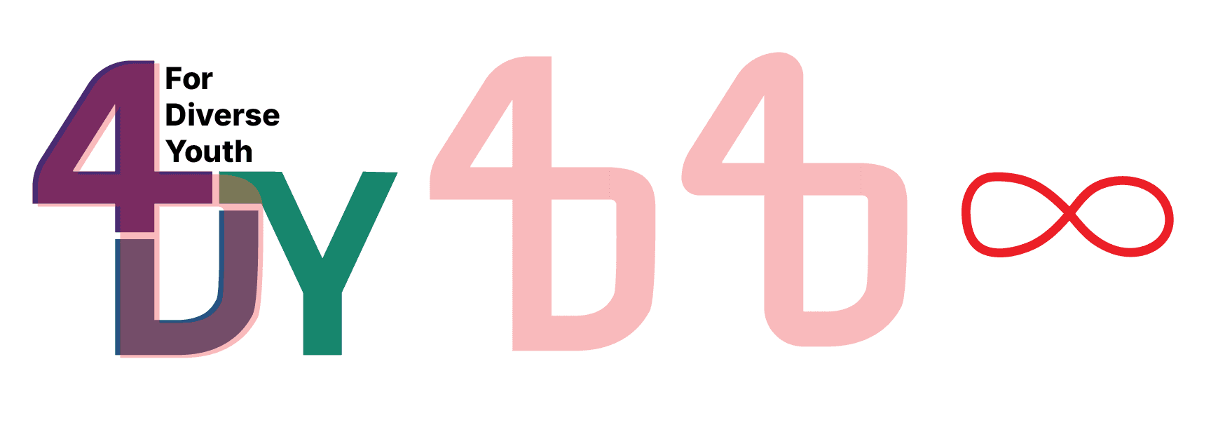
Infinity Sign
I also incorporated the infinity symbol as a subtle reference to neurodiversity and the broad spectrum of human thinking, experiences, and identities. The continuous, unbroken shape represents inclusivity, individuality, and the idea that neurodivergent youth should not be confined to rigid labels or limitations, while visually reinforcing connection, growth, and endless potential.
I also incorporated the infinity symbol as a subtle reference to neurodiversity and the broad spectrum of human thinking, experiences, and identities. The continuous, unbroken shape represents inclusivity, individuality, and the idea that neurodivergent youth should not be confined to rigid labels or limitations, while visually reinforcing connection, growth, and endless potential.
I also incorporated the infinity symbol as a subtle reference to neurodiversity and the broad spectrum of human thinking, experiences, and identities. The continuous, unbroken shape represents inclusivity, individuality, and the idea that neurodivergent youth should not be confined to rigid labels or limitations, while visually reinforcing connection, growth, and endless potential.
Final Choice
After internal consultation, my client has selected this version as their final choice for the 4DY logo.
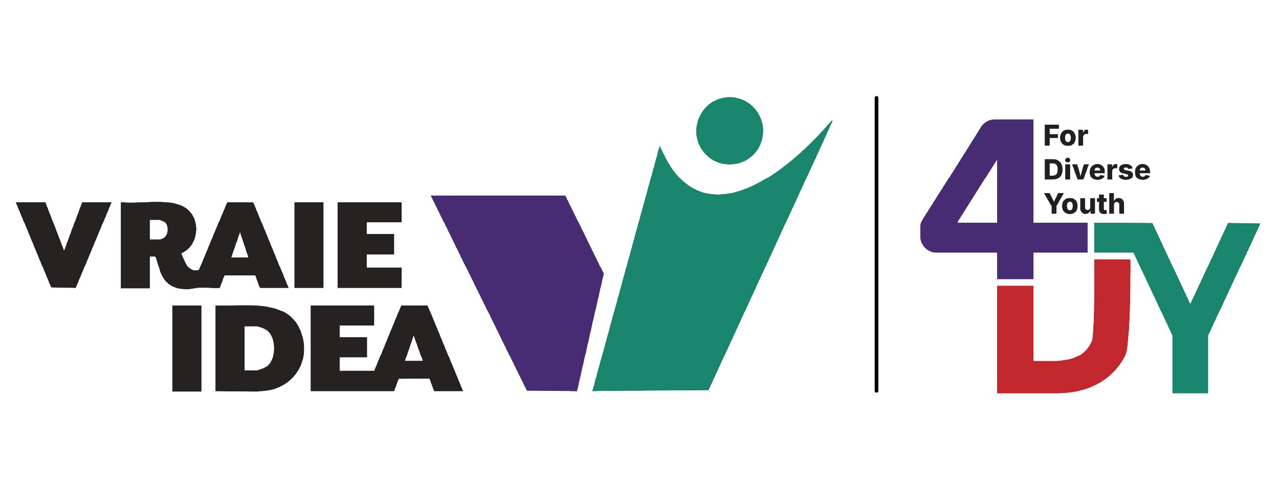
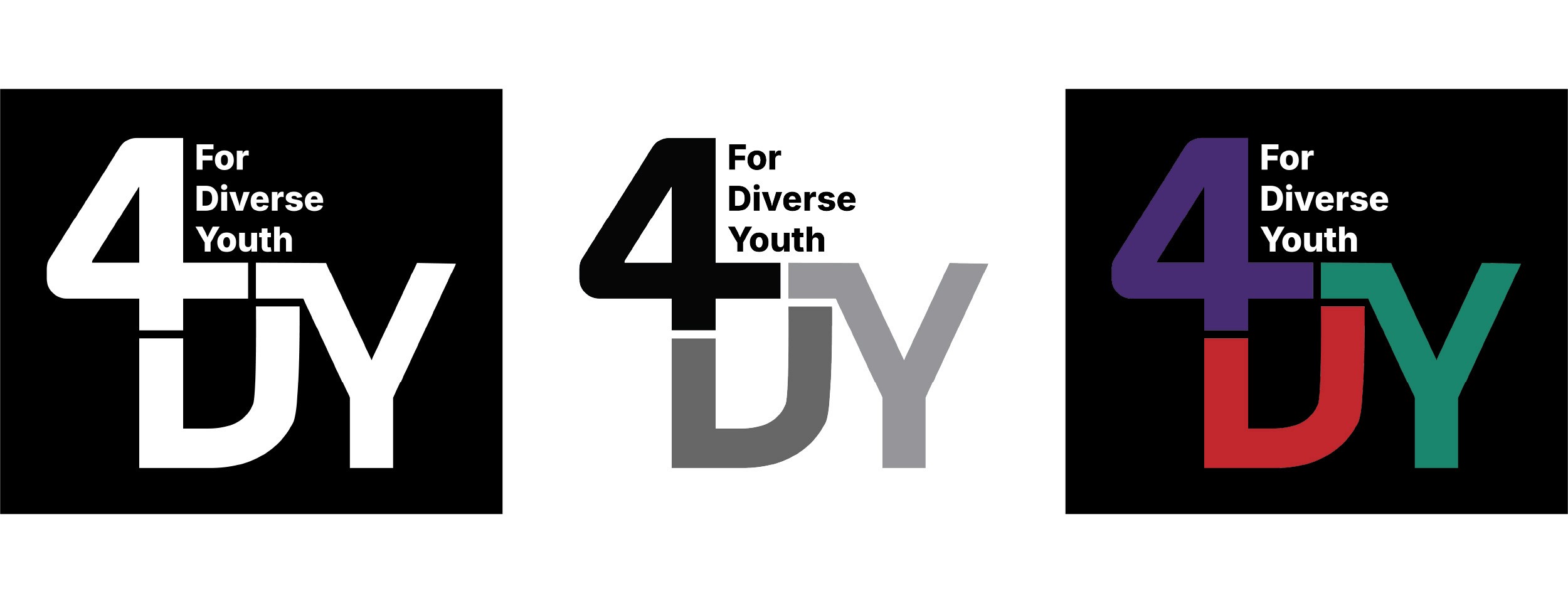
Below are the 4DY logo variations alongside the existing IDEA logo, including colour options such as black and white.
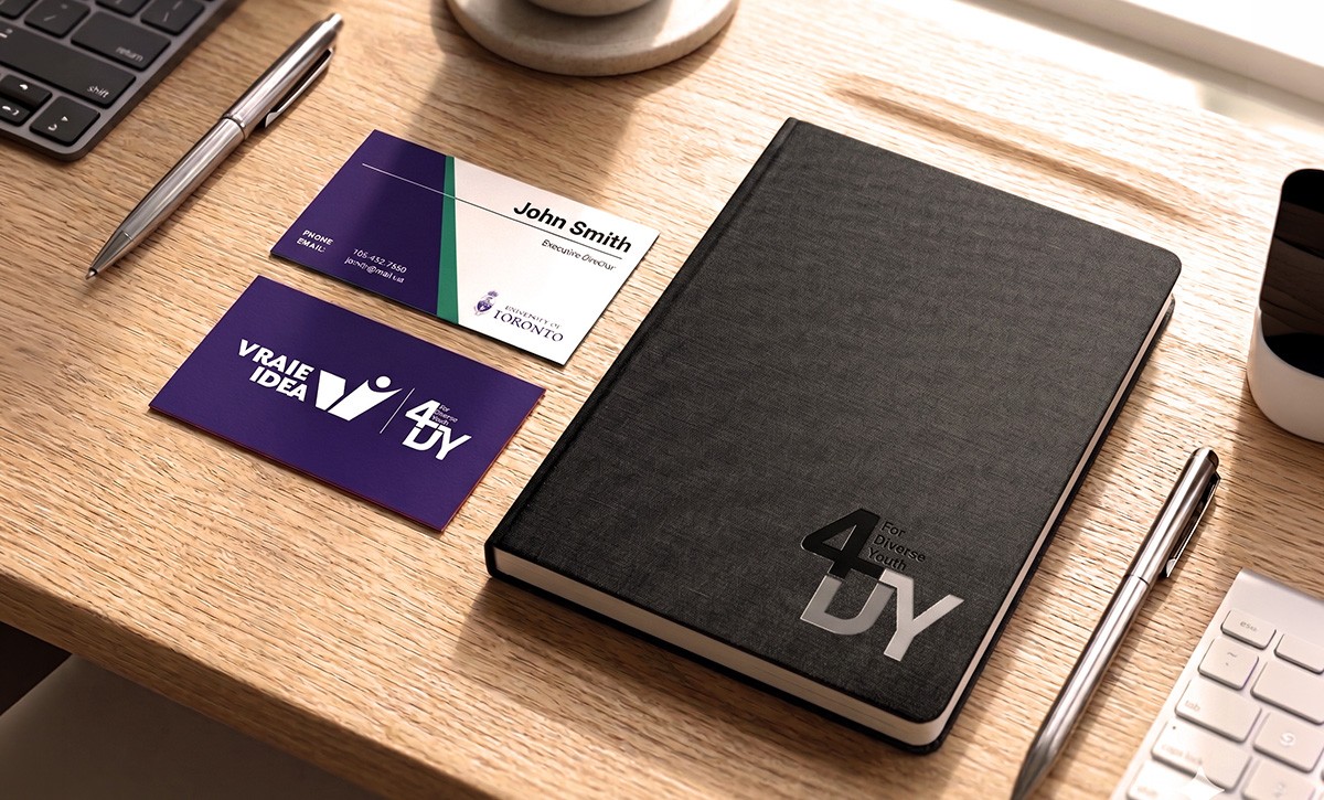
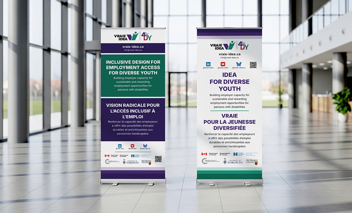
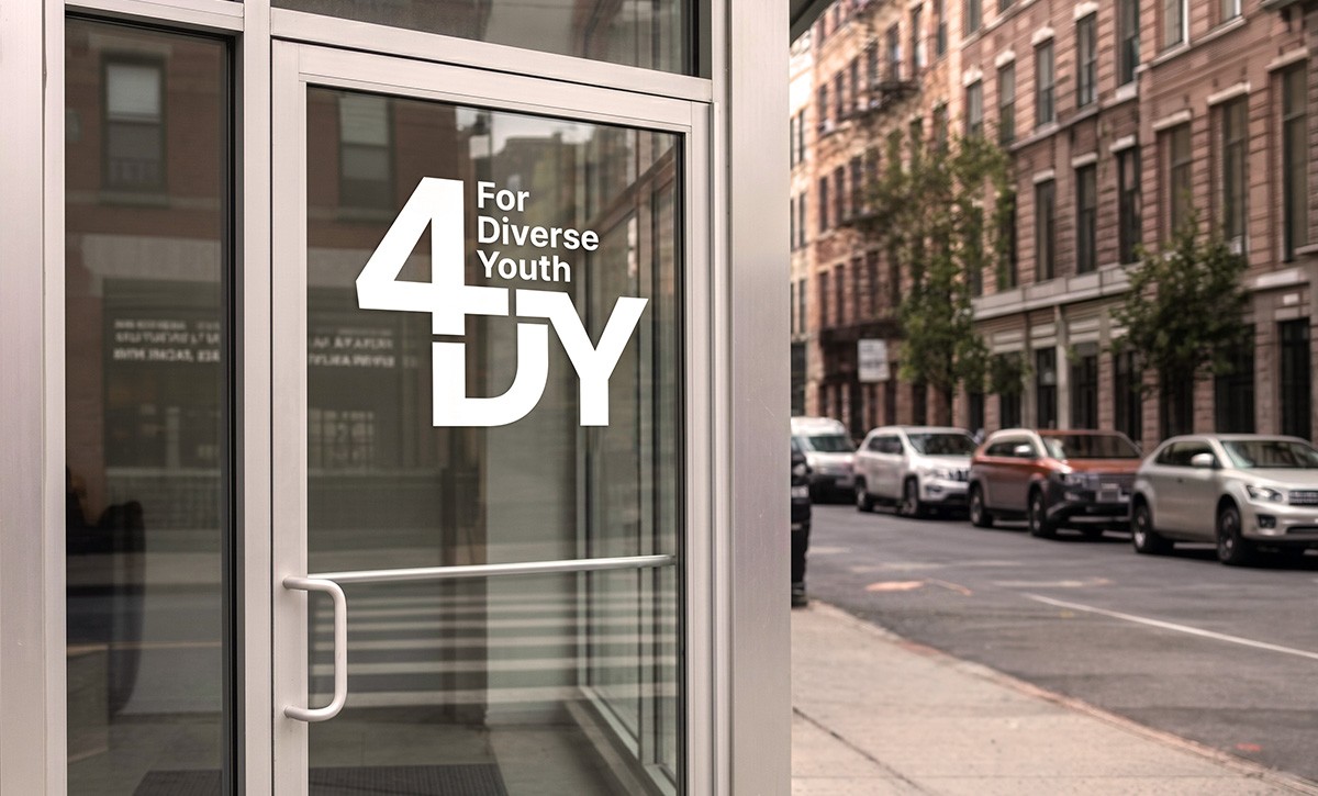
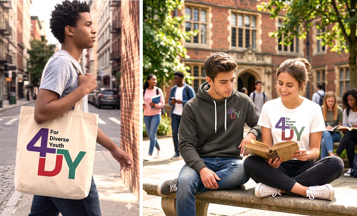
Brand Applications
This section showcases the brand applied across a variety of real-world touch points, including stationery, apparel, signage, and promotional materials. Each application was designed to maintain a consistent visual identity while demonstrating the flexibility and personality of the brand across different formats.
This section showcases the brand applied across a variety of real-world touch points, including stationery, apparel, signage, and promotional materials. Each application was designed to maintain a consistent visual identity while demonstrating the flexibility and personality of the brand across different formats.